Responsive Emails: The Why & How

Photo by Daniel Korpai on Unsplash
MOBILE IS THE MOST POPULAR READING ENVIRONMENT FOR EMAIL.
Source: Litmus 2019 State of Email Report
If you’re not creating mobile versions of your email marketing campaigns, you may be leaving money on the table. Some numbers that will convince you to use responsive emails to ensure your campaigns perform well on mobile:
Mobile email will account for 24 to 77% of email opens, depending on your target audience, product and email type. Source: eMailmonday – “the Ultimate mobile email stats” (2019)
Click rates increase on mobile devices when the email design is responsive. Source: Impact of Mobile Use on Email Engagement, MailChimp
“According to the Direct Marketing Association, $1 spent on email advertising was shown to return between $45 and $51…” Source: Why Email Marketing, Experian.com
CREATE A BETTER EXPERIENCE WITH RESPONSIVE EMAILS.
Always consider how your readers’ experience receiving a communication from you reflects on your brand to your audience, and remember that good experiences increase engagement with your campaigns. We definitely want more engagement, as a poor user experience translates into low ROI.
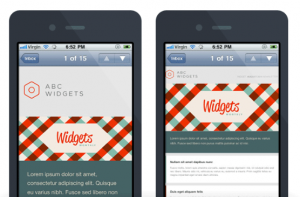
Deliver content to your readers customized to their chosen device using a solid template that automatically adjusts text size, images and CTAs (calls to action) to fit the viewing screen. See examples below (responsive email on left, non-responsive email on right):

Verify responsiveness and rendering across different email clients for desktop and mobile devices.
Preview and test multiple times, and check on an actual phone (don’t rely on the mobile preview on your desktop). Hint: Use your ESP’s inbox test or a service like Litmus to render email previews.
RESPONSIVE EMAIL BASIC DESIGN TECHNIQUES INCLUDE:
Adjusting the desktop version to a single column layout, and ensuring the text is at a legible size for mobile screens.
Placing your most important CTA and content “above the fold” in the top of the email, making sure it is not missed by the reader.
Creating tappable buttons in place of linking text to your website. Make it easier for users to engage with your content using their thumb as they hold their phone.
Utilize images at 100% width of the email body for best impact.
Other practices to consider when designing responsive email templates are:
- Moving to the footer or eliminating navigation that exists in the desktop version.
- Adding padding between elements in the layout to improve readability.
- Changing or hiding content to prevent a cluttered or very long mobile version.
- Enable tap-to-call on your customer service phone number.
WRAPPING UP
With mobile use and mobile open rates on the rise, thinking “mobile first” when crafting your email campaigns will lead you to higher open rates and engagement with your messages. Creating a responsive email template — rather than coding a new layout for each campaign — will save time and provide a better reader experience. If you have questions about creating responsive email templates or how to implement them, we are here to help!
